Search This Blog

Tuesday 19 April 2011

ToyBox

These are a few images of my ToyBox collection. The inspiration for this collection came from my mums old bear that she has had since the age of one! A well loved bear it is missing an eye and even has one leg shorter than the other, due to a DIY sewing job years ago, after a hole appeared. Its a charming piece and is full of character. I looked into other older toys such as puppets, dolls and robots to create the characters used in the prints. My style is usually quite illustrative but layering the sketches over photographic imagery gave the motifs a new dimension. I felt I needed more basic prints to sit with the collection, finding a box of vintage silk scarves, that previously belonged to my auntie, helped me create the simple spot and stripe pieces, again reworked with a hand-drawn quality.

Although the prints have been used on fashion garments they work best on interiors such as the cushion and tea set. I also had one of the robot prints made into a wallpaper which looks amazing as a feature wall. I am working on getting some of the pieces reproduced and hopefully they will be available to buy on etsy soon... I will keep you all posted!!


I mostly used digital printing on cottons but I also experimented with screen printing onto printed fabric such as this floral on stripes. I preferred the digital prints as they enabled me to use a wider range of colourways and show smaller details in the illustration.


This print worked really well on a hand-sewn notebook. 


 All transfers were placed by hand on my ceramic pieces, the tiny robots were a big hit!


I think the pom-pom trim adds a retro feel! 
I also covered the buttons to tie in with the print on the front.
 These were some of my simple fashion items created using my digitally printed fabric. I also used embroidery to add detail such as the strings on the puppet as well as screen printing a simple polka-dot on the top of the robot crop top. I looked through old family photos like the ones below to aid the shape and styling of my pieces giving them a playful child-like feel.


A few old family photos, my mum is pictured in the black and white, it is one of my favourite photos!

Monday 7 March 2011

Hundreds and Thousands

Over the weekend I have been busy with designs for Joseph Joseph who stock kitchenwares such as colourful surface protectors. The brief was to design something with mass appeal with a link to food, straight away cupcakes popped into my head! There are so many different varieties I knew I wouldn't be stuck for ideas. These are some of my initial images and motifs. Let me know what you think.


Some of the repeat prints, such as this one above, would work nicely on gift wrap too!


Tuesday 1 March 2011

Rob Ryan

My first encounter with Rob Ryans work was during a project I was basing around fast fashion and the throwaway culture we live in today. I had come across Celia Birtwells sixties paper dresses and wanted to find some more contemporary remakes. I flicked through Vogue and found a feature on just that. Designers had been challenged to create a look using this very fragile material. Many of the pieces were angular and looked somewhat futuristic. Rob Ryans, on the other hand, was simply whimsical. A simple sihouette with cut paper creating the most fantastic print. It really looked wearable!

Recently I was reminded of his talents whilst in Brighton. I found a beautiful set of mugs. His distinct style features birds and natural forms that intertwine to create amazing paper cuts and screen prints. Colour palettes are kept simple leaving the busy patterns and quirky shapes to make a statement. He has collaborated with Tatty Devine, Paul Smith and The Rug Company to name but a few. His intricate designs can be seen on products such as ceramic mugs and tiles as well as luxurious silk scarves and even jewellery. Visit his etsy shop here http://www.etsy.com/shop/misterrob or his webpage here http://www.misterrob.co.uk/.

 The amazing paper dress featured in Vogue! The colour palette is classic black and white, again, keeping it simple allowing the cutwork to be the statement. I think the use of scale in this piece is interesting, with the larger organic forms falling nearer the bottom of the dress and smaller detailing towards the waist tricking the eye and making it a very flattering piece to wear.


 An example of the products produced for Tatty Devine
 His work has also been used in retail such as this display for Liberty

Sunday 27 February 2011

Electric Dreams

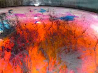
So my first post is some of my own work. I came up with these prints a while ago, I was inspired by ink movement in water contrasted with sharp electrical pulses. My style usually involves sketchy motifs so it was a challenge going in more of a digital direction! 


It was the first time I used devore to create this subtle effect on a lightweight silk, very successful although it was a nightmare mixing up the chemicals!
 I love the organic lines created when mixing heavy inks and dyes in water. It is such an inspiring starting point, the colours are so vibrant.